Tawasul
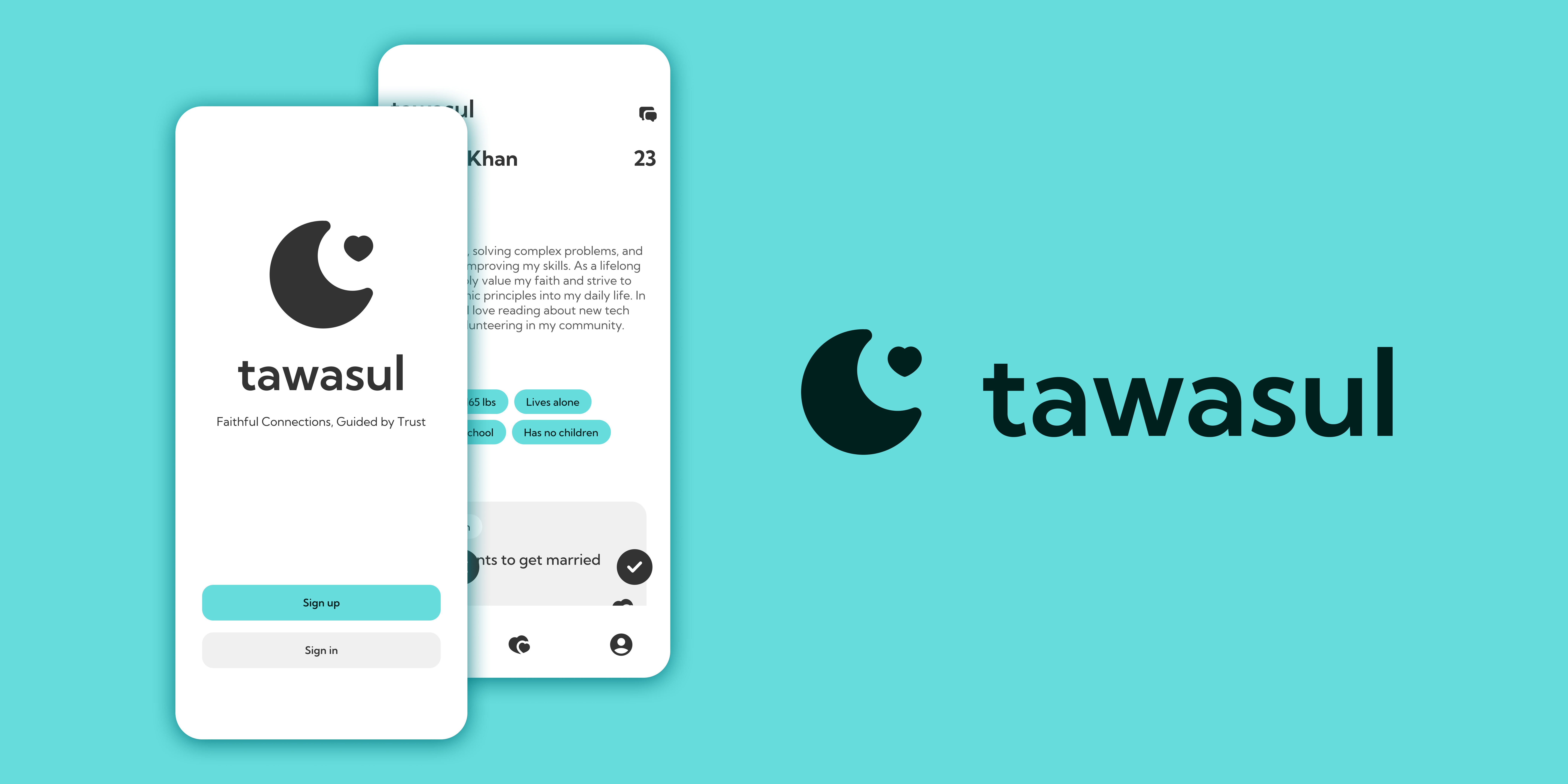
Tawasul is a matrimonial app specifically designed to cater to the unique needs of the Muslim community, focusing on creating meaningful, marriage-oriented connections.
TIMELINE
2024 June - July
ROLE
Product Designer
Front-end Developer
PURPOSE
Why did we create tawasul?
Is this just another dating app? No. Tawasul was built to meet the specific cultural and religious needs of Muslims looking for a spouse. Other apps miss the mark on what really matters in a Muslim marriage. Tawasul fills that gap by sticking to Islamic principles, helping users form meaningful, marriage-focused connections that respect their faith and traditions.
PROBLEM
What’s wrong with what is currently out there?
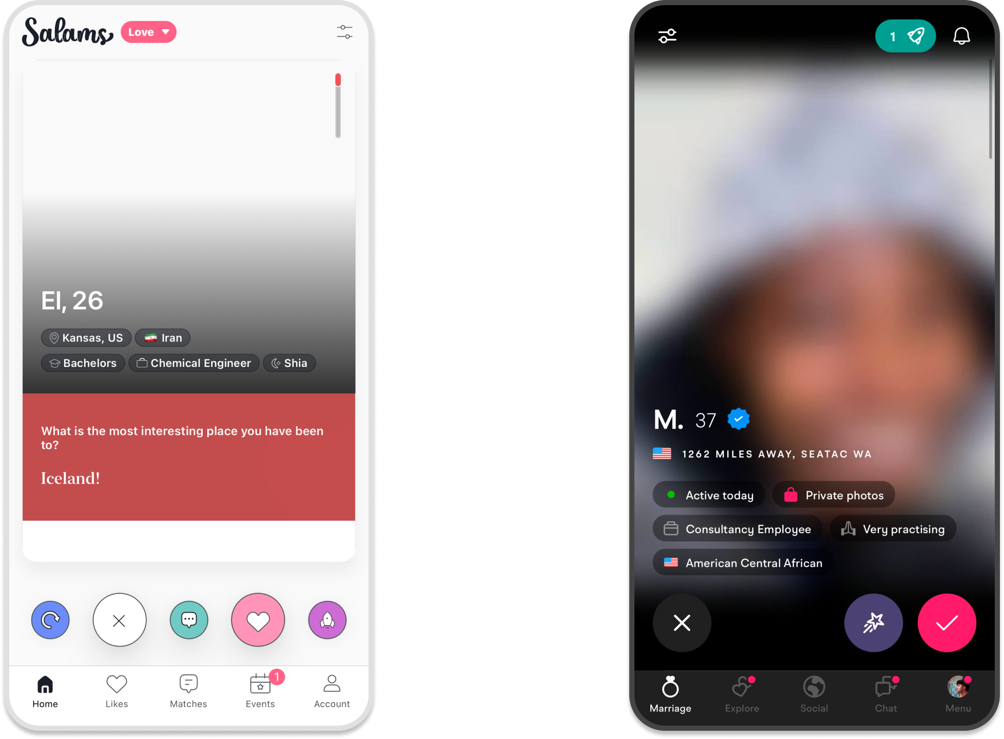
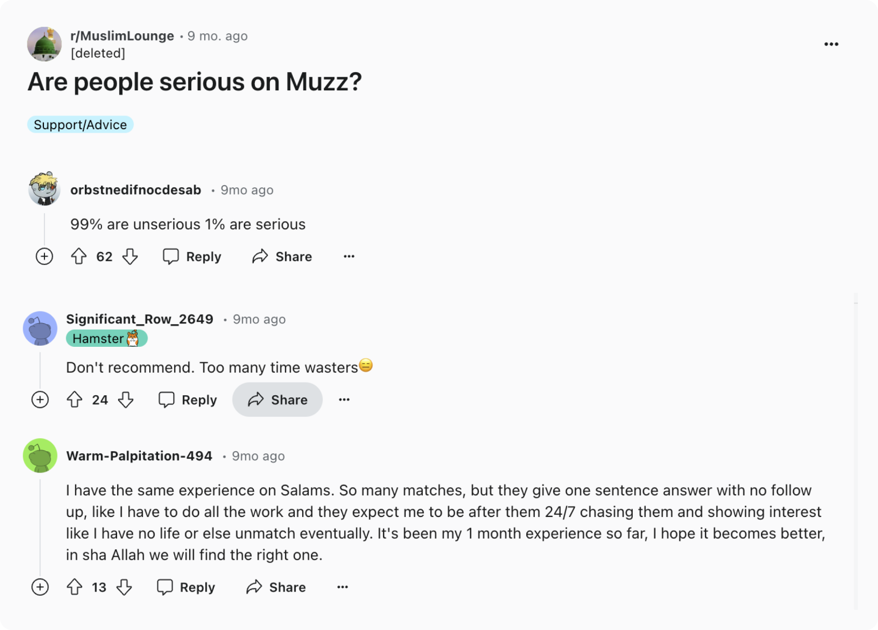
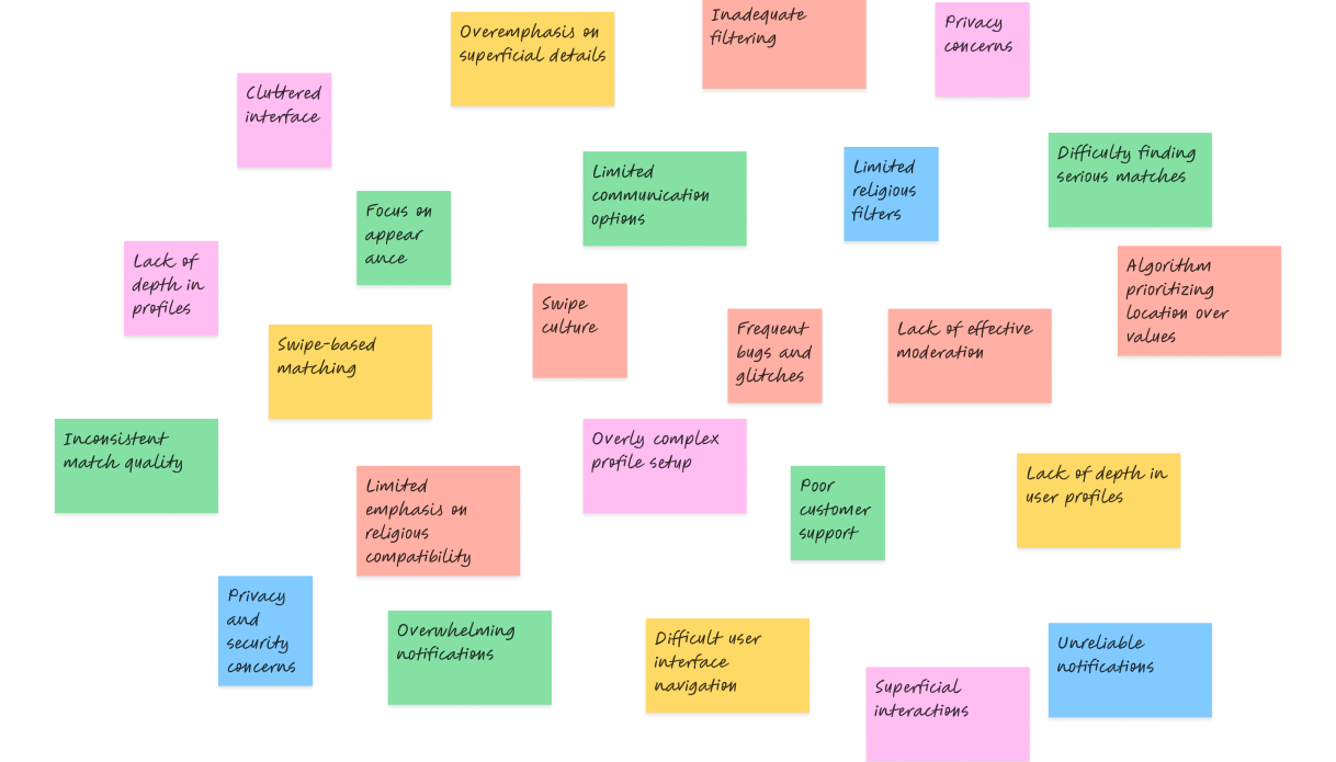
Salams and Muzz both miss the mark by focusing too much on appearances and mimicking dating apps. Their swipe-based, visually driven designs encourage quick judgments, leading to connections that might not be spiritually meaningful. In fact, there has been several concerns reached about both platforms, questioning whether they truly with the values and needs of the Muslim community.
A breakdown of the pain points.
We conducted in-depth interviews with users to gather insights on their experiences and frustrations with existing apps. By focusing on key pain points like superficiality, inadequate filtering, and privacy concerns, we were able to understand what users truly value in a matchmaking platform. These interviews highlighted the need for a more thoughtful, value-driven approach, which we used to inform our app's design and functionality.
What stood out to us...
Privacy
Displaying user images prominently raises significant privacy concerns, conflicting with Islamic principles of modesty. This design choice can make users uncomfortable, highlighting the need for a more culturally sensitive approach to privacy.
Swiping and matching
The swipe-based design encourages quick, appearance-focused decisions and allows for multiple matches at once, leading to shallow connections. This approach detracts from the intentional, meaningful relationships that are vital in a Muslim matrimonial context.
LIMITATIONS
Crunch time!!!
With just one month to code and design the app, time was my biggest constraint. I couldn't take the liberty to start from scratch, so I had to work within the boundaries of Material Design. This meant customizing it extensively to fit the app's unique needs. Additionally, I had to reuse custom-made components multiple times to stay efficient and meet the tight deadline. Despite these challenges, I focused on delivering a functional and visually cohesive app that aligns with the project's goals.
BRAND
Branding and Styles
V1 - Brown really???
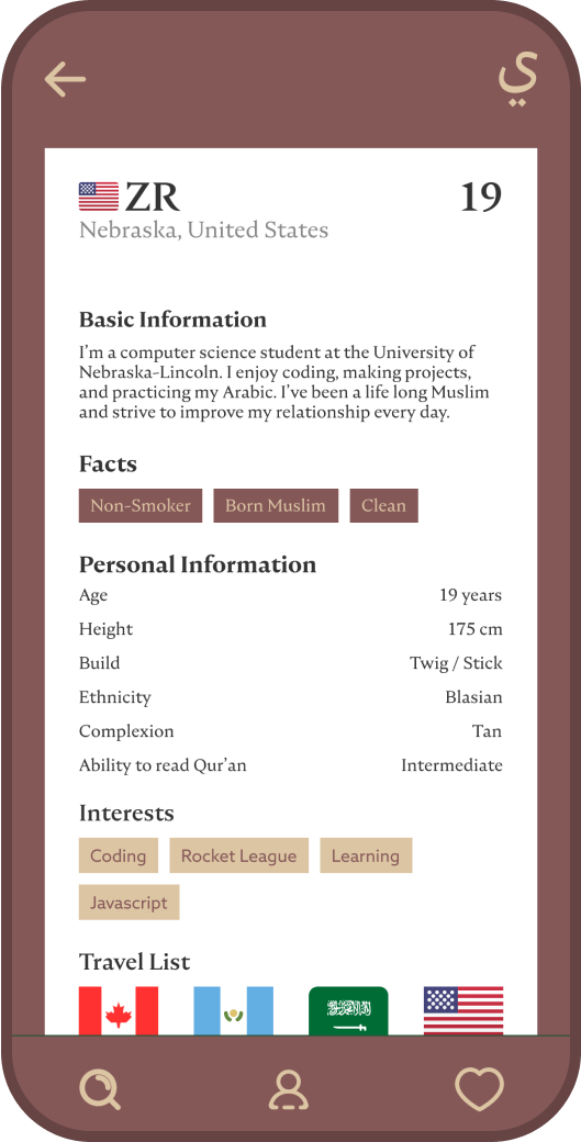
Brown, really? Yeah, I know... it wasn’t just the color that fell flat. The fonts were clunky and heavy, giving off an outdated vibe. The icons didn’t help either—they were bland and didn’t convey the clean, modern feel we wanted. The whole design made the app look like a relic, not something fresh or engaging, and definitely didn’t do the brand any favors.
V2 - Boring, Boring, Boring
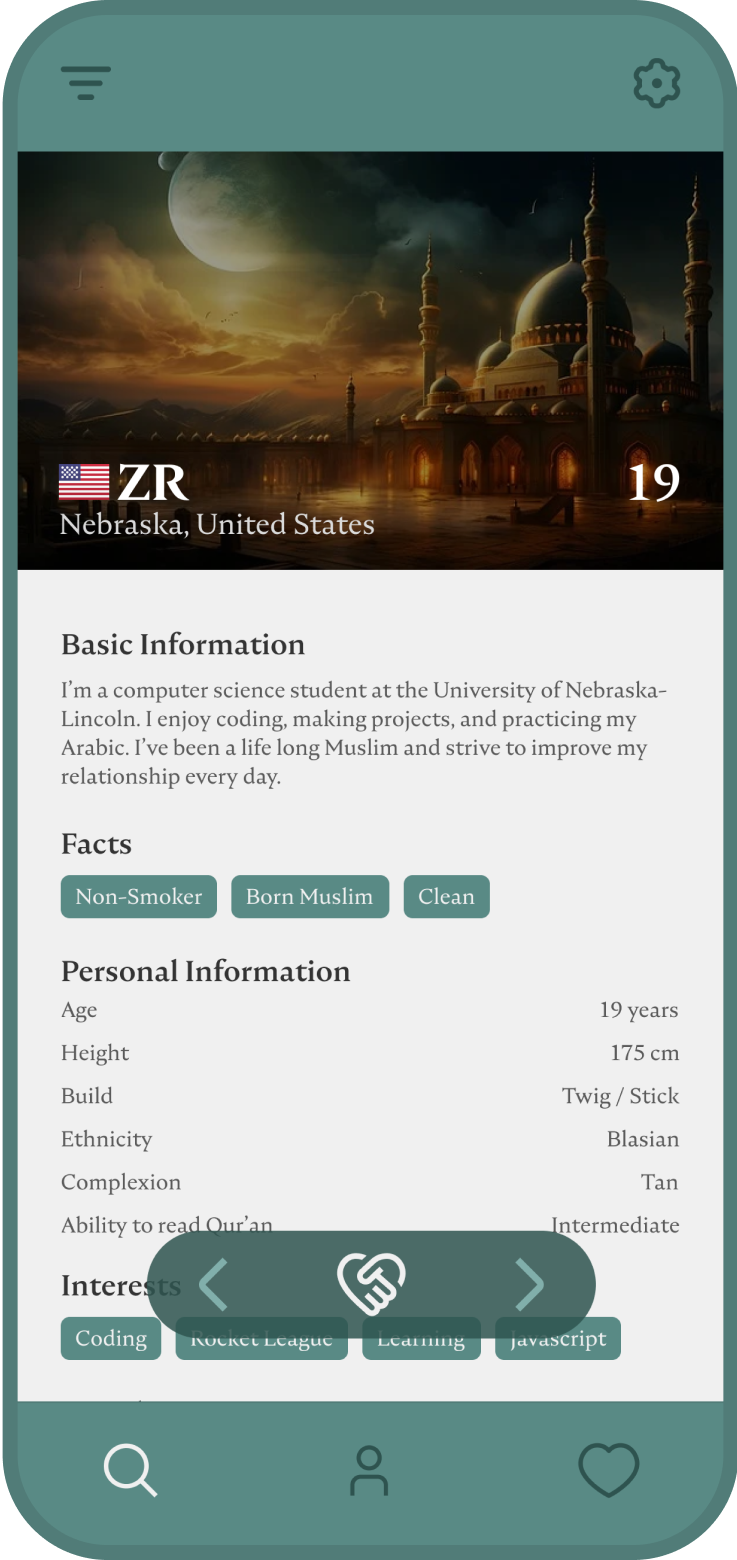
Dark green was an improvement, but it still didn’t quite hit the mark. The fonts were more polished but leaned too much into the serious side, making the brand feel a bit too stiff. The icons, while better, still felt too generic. It was like the app was trying to be professional but ended up losing the dynamic energy the brand needed to connect with users.
V3 - Just Right.
Teal? Now we’re talking. It wasn’t just the color that made it work—everything came together here. The fonts are crisp and modern, giving the app a clean, contemporary look. The icons are finally on point—simple, intuitive, and stylish, they enhance the user experience without overwhelming it. This design makes the app both trustworthy and engaging. This is the look that’ll help us stand out and resonate with users.
SOLUTION
The ideal solution for our niche
We focused on the inclusion of the wali (guardian), limiting users to one request at a time, which resonated well with our users. By avoiding personal images, we upheld privacy and modesty, steering clear of the superficial "Tinder" swipe culture. What seemed like limitations, such as the absence of photos, turned into creative solutions that strengthened the app's unique value.
User Flow
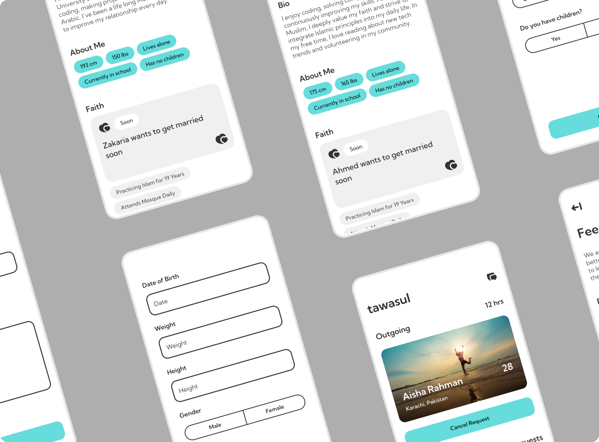
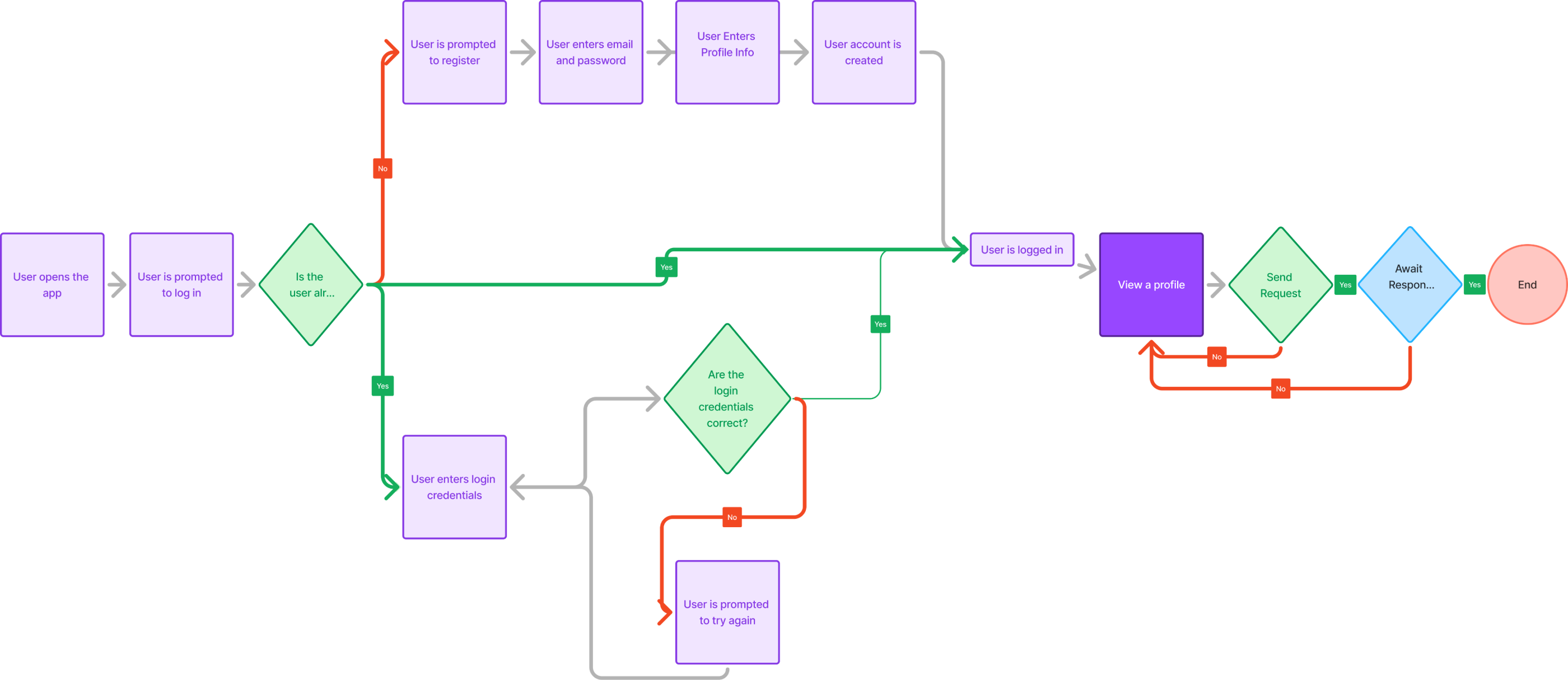
The user flow is streamlined and concise, guiding users quickly from login or registration to viewing profiles and sending connection requests. It focuses on simplicity and efficiency, ensuring users can easily navigate the process while maintaining security and privacy.
Onboarding
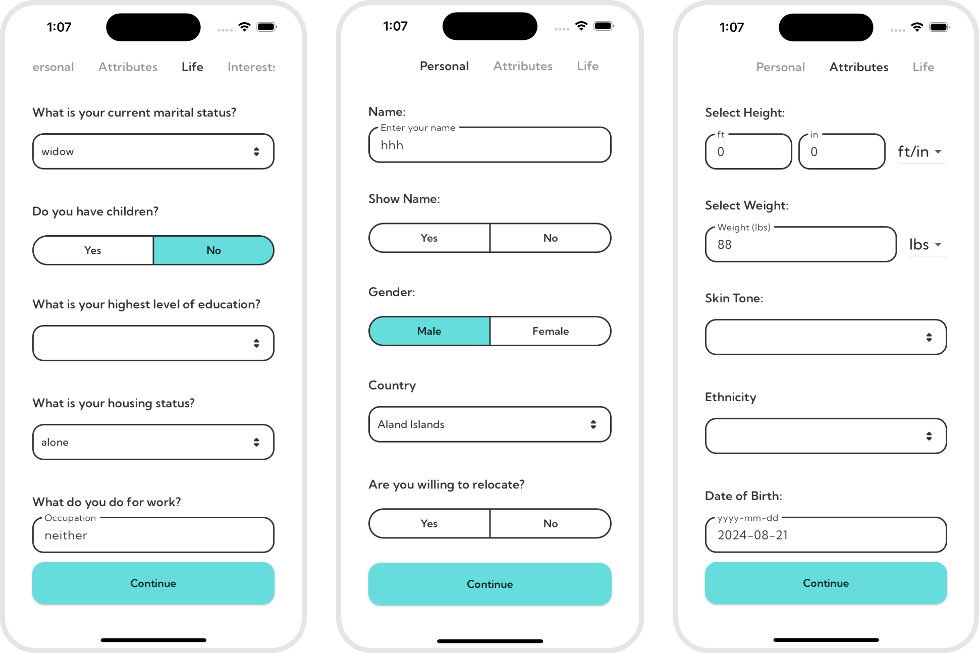
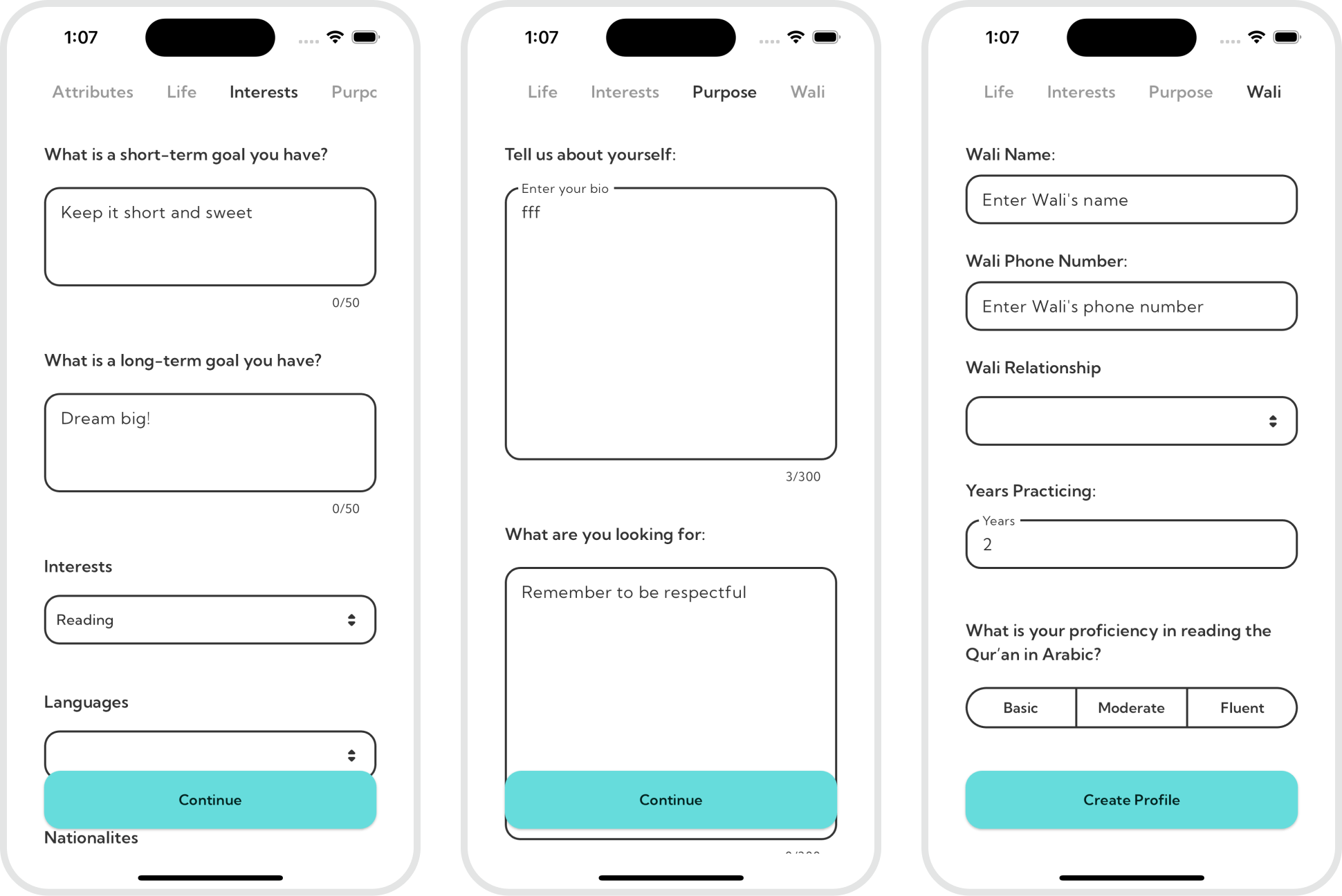
The profile creation process is streamlined into key sections: basic info, physical attributes, personal details, goals, and wali information. Each section captures essential data without overwhelming users, ensuring a smooth and efficient onboarding experience while staying aligned with the app's focus on meaningful connections.
Finding the ideal partner
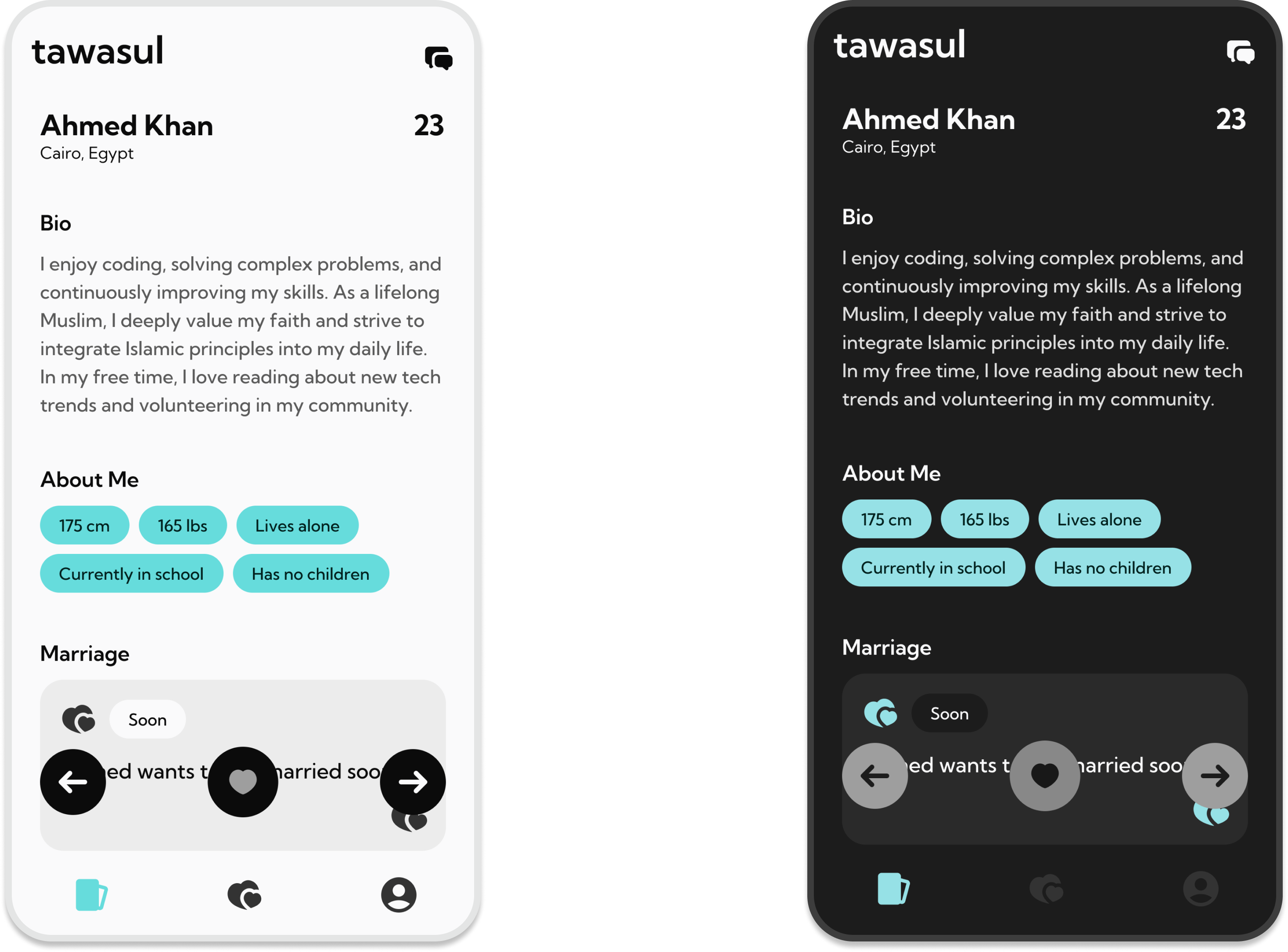
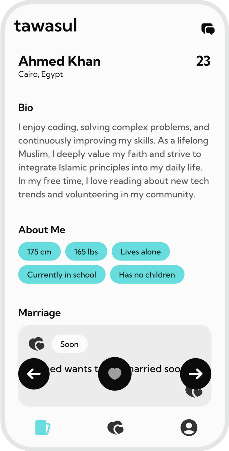
The profile view layout is designed to be easy to scan, allowing users to quickly absorb the most important details. Unlike swipe-based apps, our profiles are intentionally not swipable, encouraging users to take their time reviewing each profile. This approach fosters deeper consideration and aligns with our focus on meaningful, faith-based connections rather than quick, superficial decisions.
Our match making process
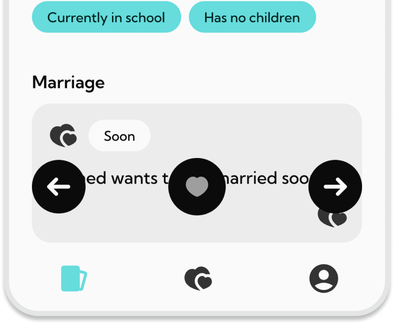
Request
This section makes sending a request easy with clear, intuitive buttons. The heart icon lets users send a request quickly, while arrows allow for thoughtful profile review, emphasizing deliberate connections over quick swipes.
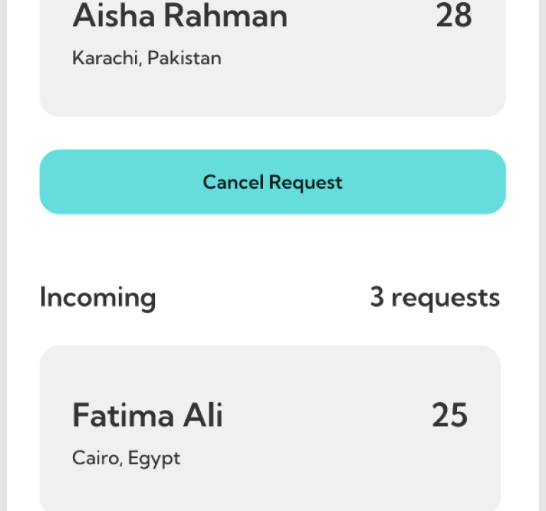
Accept
After sending a request, the other user sees it in their "Incoming" list, where they can quickly review and respond, ensuring a smooth and efficient connection process.
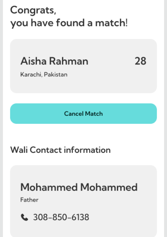
MATCH!
Once a match is made, the user is notified and provided with the wali’s contact information, making it easy to take the next steps in a respectful and faith-aligned manner.
How hard was this to actually code?
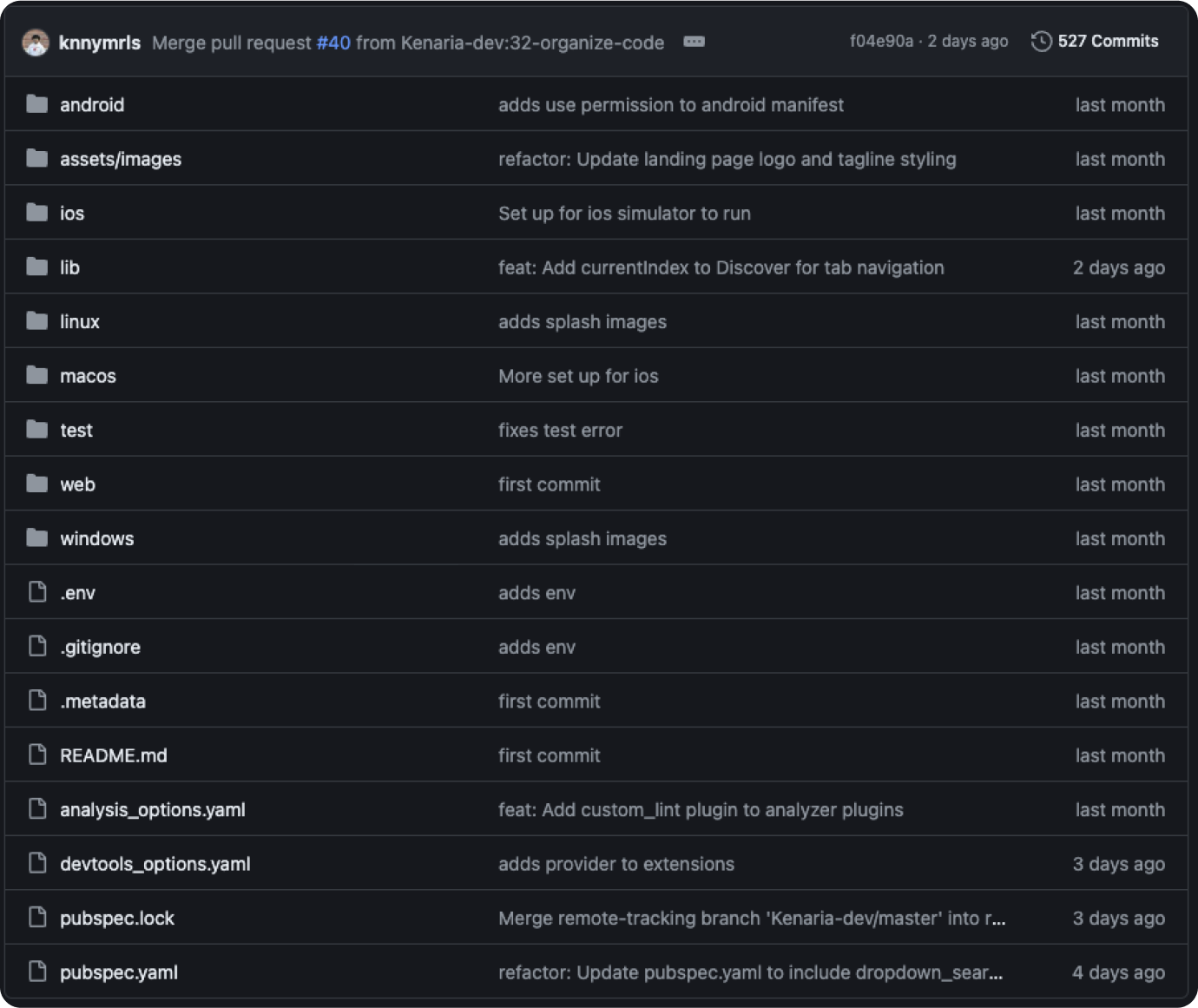
Honestly, coding this was no joke. With over 500 commits, there was a lot of refactoring, bug fixing, and adding new features. But honestly, the limitations in components and screens actually made it a lot easier to focus and get everything working smoothly across the board.
FINAL NOTES
Lots of lessons learned...
This project pushed us to balance ambition with practicality, especially across multiple platforms. We faced challenges head-on, whether it was dealing with limited components or simplifying the design. In the end, these constraints actually became strengths, leading to a cleaner, more focused app. The journey taught us to be resourceful, adapt quickly, and stay committed to delivering a solid, user-centered experience.