PROJECT OVERVIEW
Introducing Colab
Colab is a web app I solely designed to simplify group project collaboration for students. It offers intuitive tools for task management, time tracking, communication, and file sharing, allowing teams to work together efficiently and effectively. In Colab, students can easily view tasks, track progress, and manage deadlines through visual elements like Kanban boards and timelines. With features like automatic meeting scheduling and an integrated chat system, Colab streamlines teamwork and ensures every group member is on the same page.
DESIGN INSPIRATION
The Story Behind Colab
Colab was inspired by the common challenges students face when working on group projects. Disorganized communication, unclear task delegation, and difficulty tracking progress often lead to frustration and inefficiency. The goal was to create a tool that eliminates these pain points while fostering better teamwork and productivity.
My vision was to design a platform that made collaboration seamless and intuitive. Drawing from personal experiences and user research, Colab became a tool tailored to students' needs, combining simplicity and functionality in one powerful platform.
TARGET AUDIENCE
Designed for Students
Colab is built for students engaged in group projects, particularly in academic settings. Its user-friendly design ensures that students, regardless of their technical expertise, can quickly navigate and use the platform effectively.
The app is primarily a web-based platform, providing accessibility across devices with a companion mobile app. This flexibility allows students to stay connected, update tasks, and communicate with their team anytime, anywhere.


PROTOTYPE DEVELOPMENT
How the prototype evolved
Colab went through multiple iterations based on thorough testing and analysis. While initial user feedback was positive, I identified areas for improvement through deeper observation and additional user insights. Below is the journey of the prototype's development and the key changes made along the way.
When considering the design system for Colab, I focused on creating a clean and intuitive UI that was easy to navigate. The color palette was chosen to be vibrant and engaging, with a only one primary color to really hone in on simplicity. The typography was selected to be clear and legible, ensuring that users could easily read and understand the content on the screen. The overall design aimed to be modern and simple, reflecting the app's purpose as a collaboration tool for students. The use of white space and visual hierarchy helped ensure that the most important information stood out against a more neutral background, creating a clear focus for the user without feeling too overwhelming. The rounding of corners make the app feel more friendly and approachable, which is important for a tool that students will be using regularly. Overall, the design system was created to carry on the idea of simiplicity while maintaining a modern feel.
INITIAL PROTOTYPE
What it started as
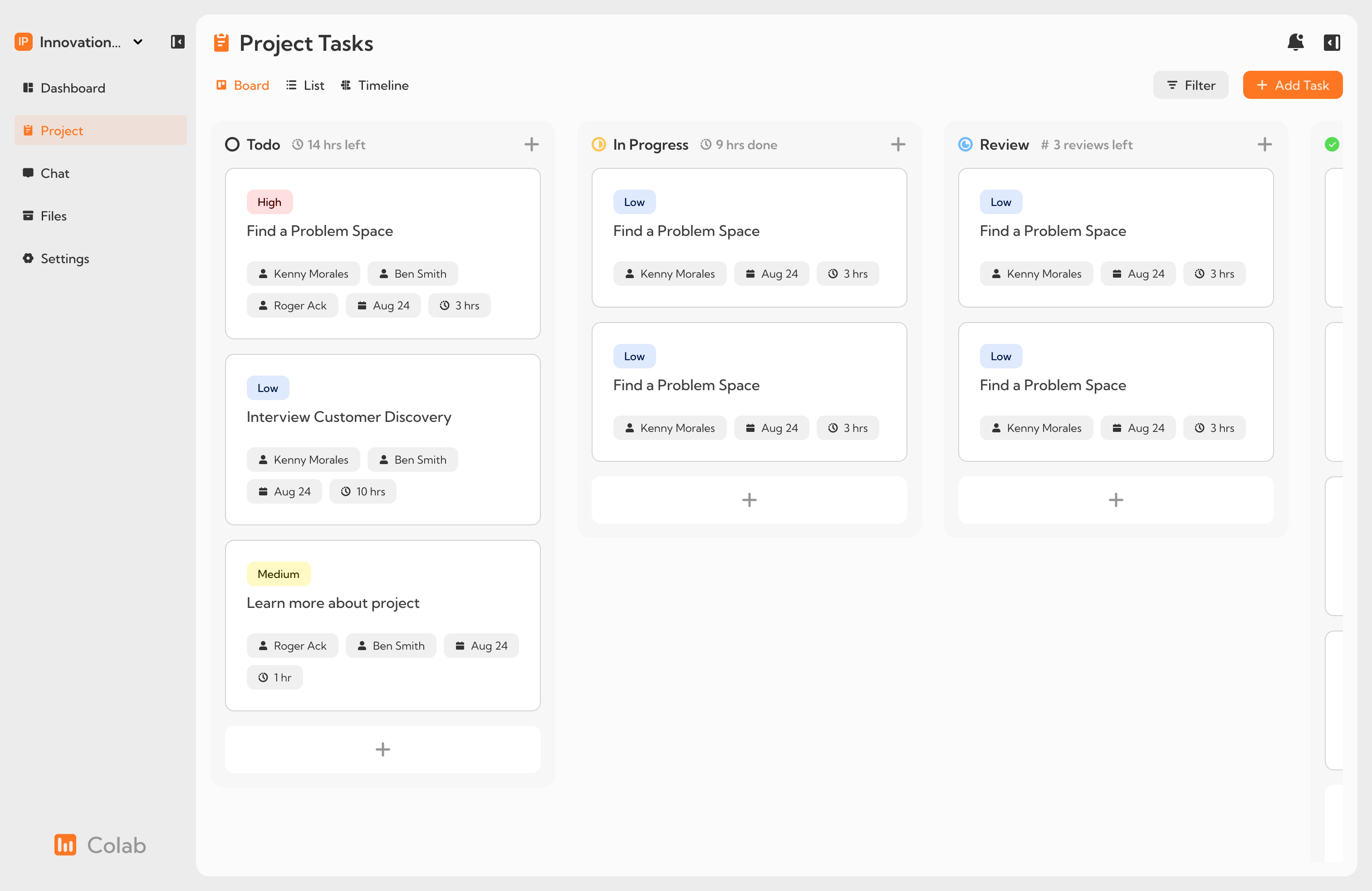
The initial prototype included all the core features but lacked refinement in several areas. Some elements, like task cards, were cluttered and hard to scan. There was also ambiguity around assigning tasks and tracking progress. These issues were identified during testing.
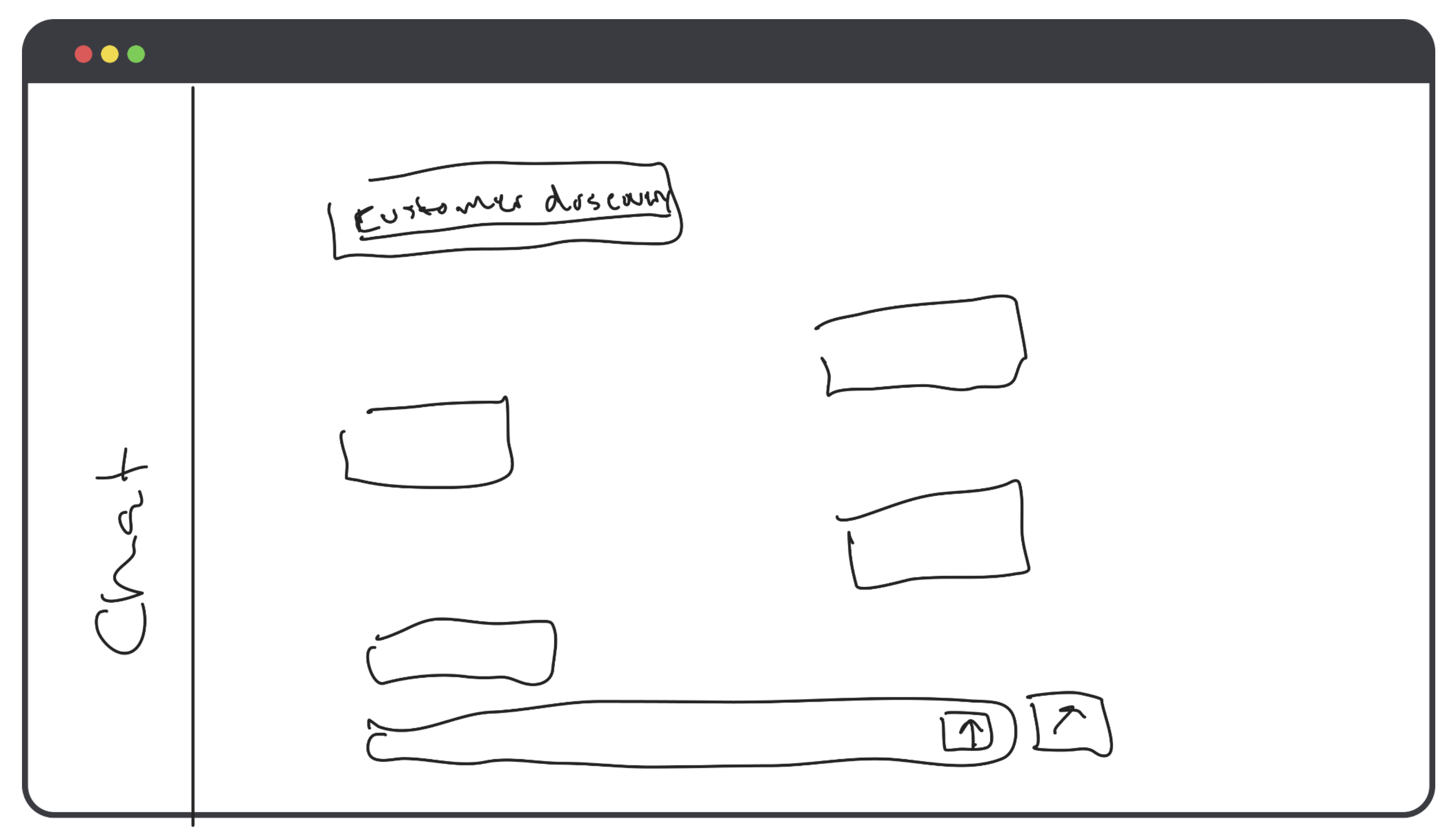
Upon the onboarding process, users were greeted with a simple welcome screen that introduced the app's core features. The main dashboard displayed a Kanban board with tasks organized by status, making it easy for users to track progress. The chat system was integrated into the dashboard, allowing users to communicate with their team members in real-time. The time tracking feature was also present, showing the total time spent on tasks and the remaining time for each project.
COLLEGIATE ASSESSMENT
Peer feedback and insights
Colab underwent a collegiate assessment where peers provided valuable feedback on the design and functionality of the prototype. This collaborative critique highlighted strengths in the app’s usability and identified key areas for improvement.
The assessment focused on features like task visibility, user flow, and ease of communication. Participants appreciated the intuitive interface and robust functionality, especially the Kanban board and integrated chat system. However, several areas of improvement were suggested:
- Improve task card hierarchy to enhance scannability.
- Clarify how time spent on tasks is calculated and displayed.
- Revisit visual contrast to ensure accessibility.
- Simplify task creation flow to minimize confusion.
Changes implemented based on feedback
To address the feedback, I implemented the following updates:
- Redesigned task cards to include clear sections for due dates, tags, and assigned users.
- Revised the time tracking feature to present data more intuitively.
- Adjusted contrast ratios across the app to improve accessibility for all users.
- Streamlined the task creation process by removing redundant elements.
These changes helped refine the user experience and aligned the app more closely with the needs of its target audience.
USER FEEDBACK AND TESTING
What the users said
Through user testing, I observed how users interacted with the app by asking them to perform tasks such as adding a task, finding completed tasks, and locating the chat. While most users found the app intuitive, key areas for improvement emerged:
- Task cards were not easily scannable due to lack of structure.
- Task assignments were unclear, requiring better visualization.
- Redundant "Add Task" buttons created confusion.
- Unnecessary text on progress hours cluttered the interface.
REFINED PROTOTYPE
What changed
Based on these findings, I implemented the following changes to improve usability and enhance the user experience:
- Added structure to task cards to make critical information, such as due dates, easier to locate.
- Replaced name tags with user avatars for task assignments, improving visibility at a glance.
- Removed redundant "Add Task" buttons to simplify the user interface.
- Removed unnecessary progress text and planned future integration into a sidebar.
CONCLUSION
Reflections and final thoughts
The journey of designing and developing Colab has been an incredible learning experience, showcasing the importance of user-centric design and iterative development. Starting from an initial idea inspired by common student challenges, the app evolved through thoughtful feedback, testing, and refinement into a functional, user-friendly tool that meets the needs of its target audience.
Throughout this process, I’ve gained valuable insights into balancing simplicity and functionality, addressing user pain points, and ensuring accessibility for a diverse user base. Colab not only represents a solution for group collaboration but also highlights the impact of a well-designed interface in enhancing productivity and reducing friction.
This project has reinforced my passion for creating meaningful, impactful designs. While Colab is already a robust tool, I’m excited about its potential for further innovation and expansion. It’s a reminder of how thoughtful design can turn a vision into a solution that makes a difference in people's lives.
Designed and Developed by Kenny Morales • 2024