Exploring the Relationship Between Art and UI Design
For this assignment, we’re looking at how art can inspire user interface design. While we’ve spent a lot of time focusing on usability and interactions, the truth is, none of that really hits home unless it’s paired with great visuals. A functional interface is important, sure, but people are also drawn to beauty and emotion, and that’s where design comes in. So, to dig deeper into this, I took a trip to a museum and picked a piece of art that I found particularly inspiring.

Art Piece Summary
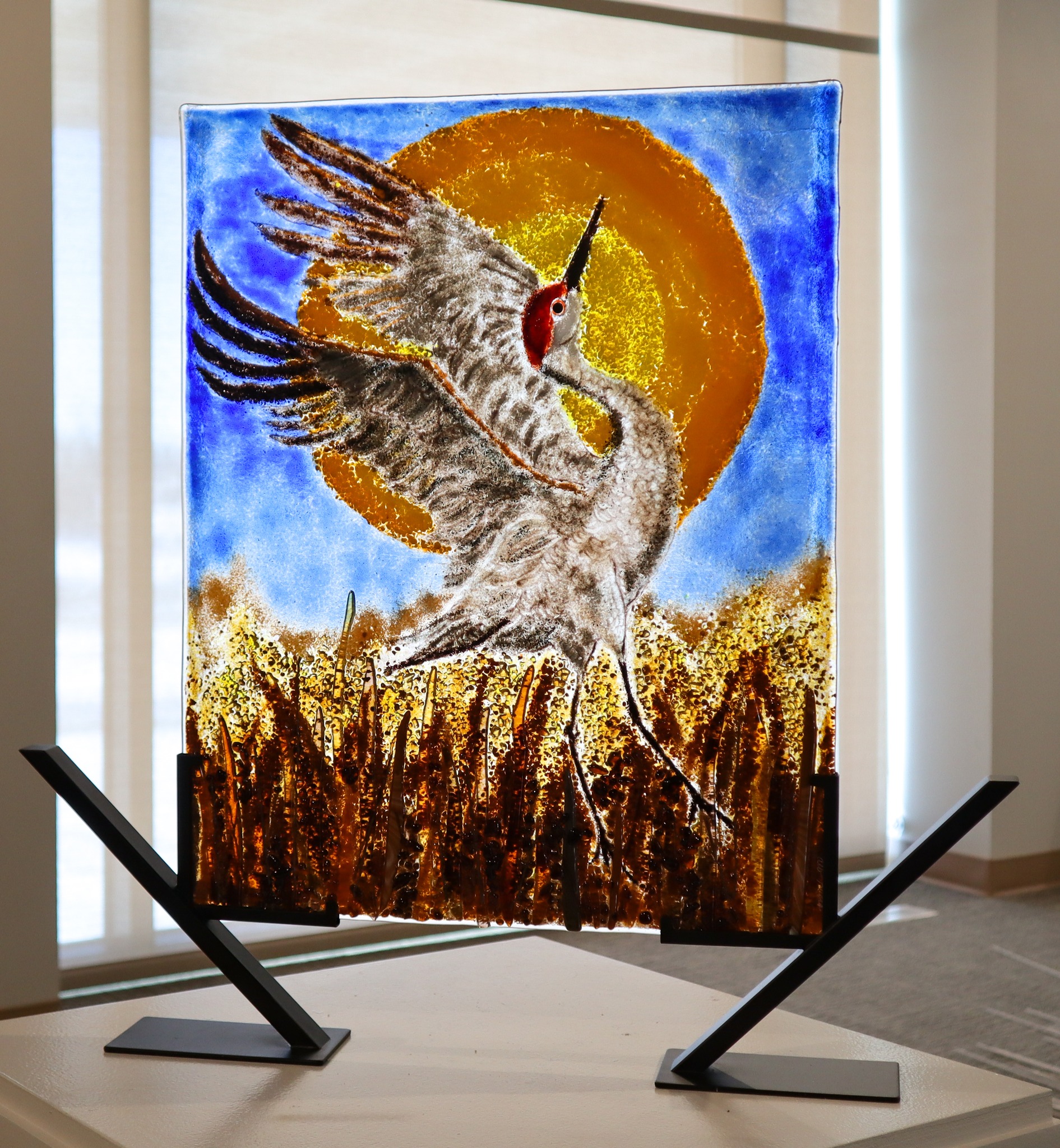
The artwork I chose features a crane in flight with its wings fully stretched out, set against a glowing orange sun. There’s something about the way the bird’s wings spread wide that gives off this feeling of freedom and power. The bold contrast between the bright, warm sun and the cooler blue sky really makes the whole thing pop. While I didn’t get much info on the artist or the history behind the piece, it’s clear that this is about capturing nature’s grace in a bold and expressive way. The piece is rooted in natural beauty, and it evokes a sense of serenity and wonder.
Art Piece Analysis
1. Color Balance
The way the bright orange sun plays off the cool blue sky is what caught my eye first. The contrast between the warm and cool tones gives the whole piece this dynamic energy. In terms of UI design, this could translate into making important elements, like buttons or alerts, stand out against a more neutral background, creating a clear focus for the user without feeling too overwhelming.
2. Movement
There’s a real sense of movement in how the crane is positioned. You can almost feel the wind under its wings as it’s about to take off. In UI design, this kind of fluid motion could inspire animations that are smooth and natural. For example, transitions between screens could mimic that same graceful movement, making the whole experience feel more intuitive and engaging.
3. Contrast and Focus
The sharp detail of the crane against the more abstract background really helps it stand out. There’s no question where the focus of the piece is, which got me thinking about how contrast can be used in UI to guide users' attention to the most important parts of the screen. Bold text, clear headings, or distinct color differences could be used to create a similar effect.
UI Sketch Inspired by the Art Piece

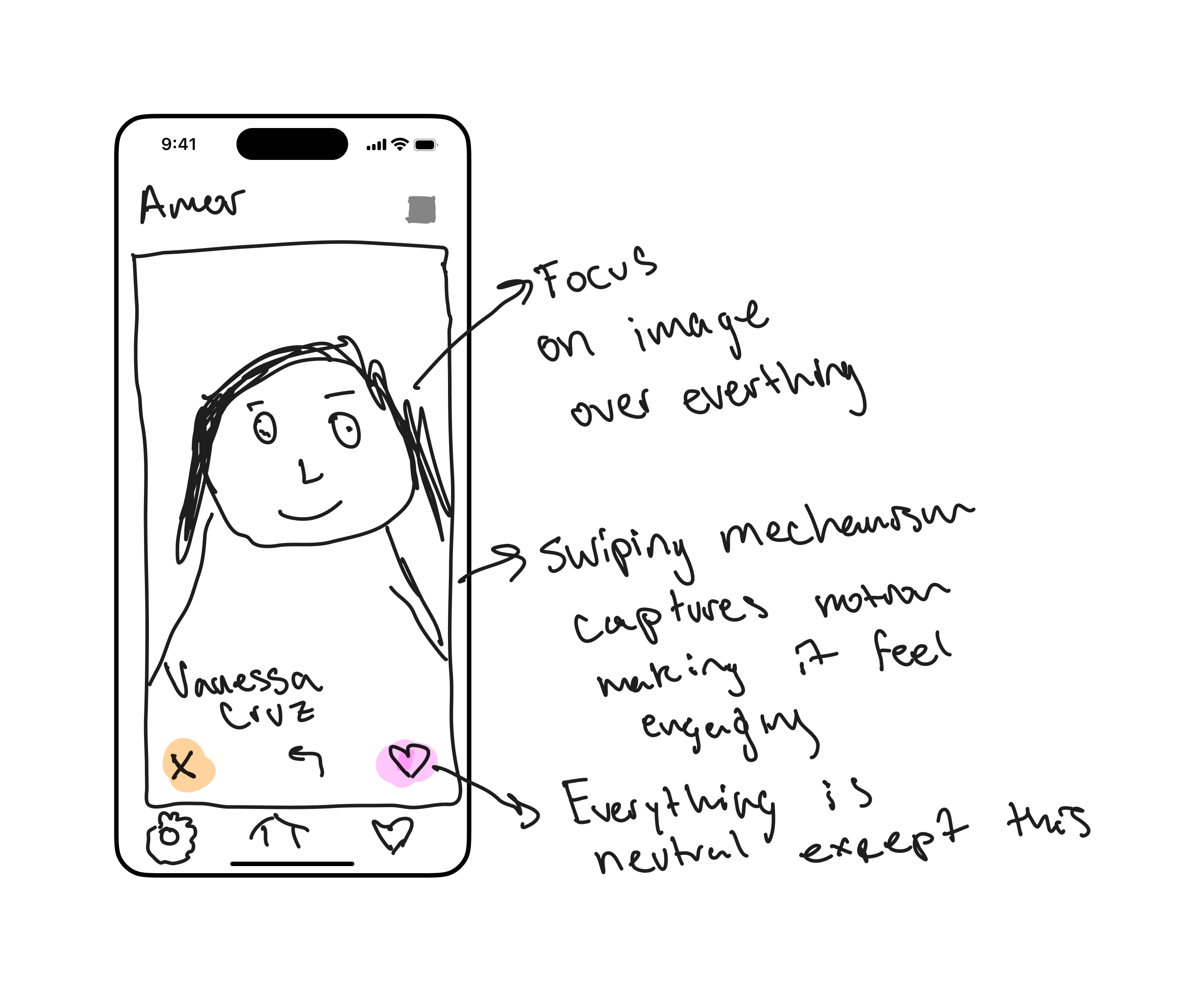
Using these three ideas—color balance, movement, and contrast—I sketched out a UI for a dating app that’s inspired by the art piece. The app is designed to help users find potential matches based on their interests and values, and the specific customer is hispanic people like me. The app is desinged to be used on mobile devices, so the design is optimized for smaller screens. The main screen features a large image of a potential match, with like and dislike buttons below it. Users can swipe left or right to indicate their interest, and the app will show them more profiles based on their preferences. The color scheme is minimal, with the like and dislike buttons standing out against a more muted background. The overall look is clean and minimal, with a focus on the potential match’s image.
- Color Balance: I took the use of bright colors from the art piece and used it for the like and dislike buttons, to make them stand out and draw the user’s eye. The rest of the app uses a more muted color palette to keep the focus on these key actions.
- Movement: The way the crane looks like it’s about to take off inspired me to add some sort of motion, which is emulated by the micro-interactions like swiping left or right to like or dislike a news article. This adds a sense of fluidity and makes the app feel more dynamic.
- Contrast and Focus: Just like the crane stands out against its background, I made sure that the image of the potential match is the focal point of the screen. The rest of the app is designed to be clean and minimal, so the user’s attention is always drawn to the most important part of the interface.
Final Thoughts
This whole process really highlighted how important it is to bring in elements from art to create something that resonates emotionally with users. Functionality is key, but when you add in thoughtful design, it creates an experience that sticks with people. Which is something that personally resonates with me as a designer.
Designed and Developed by Kenny Morales • 2024