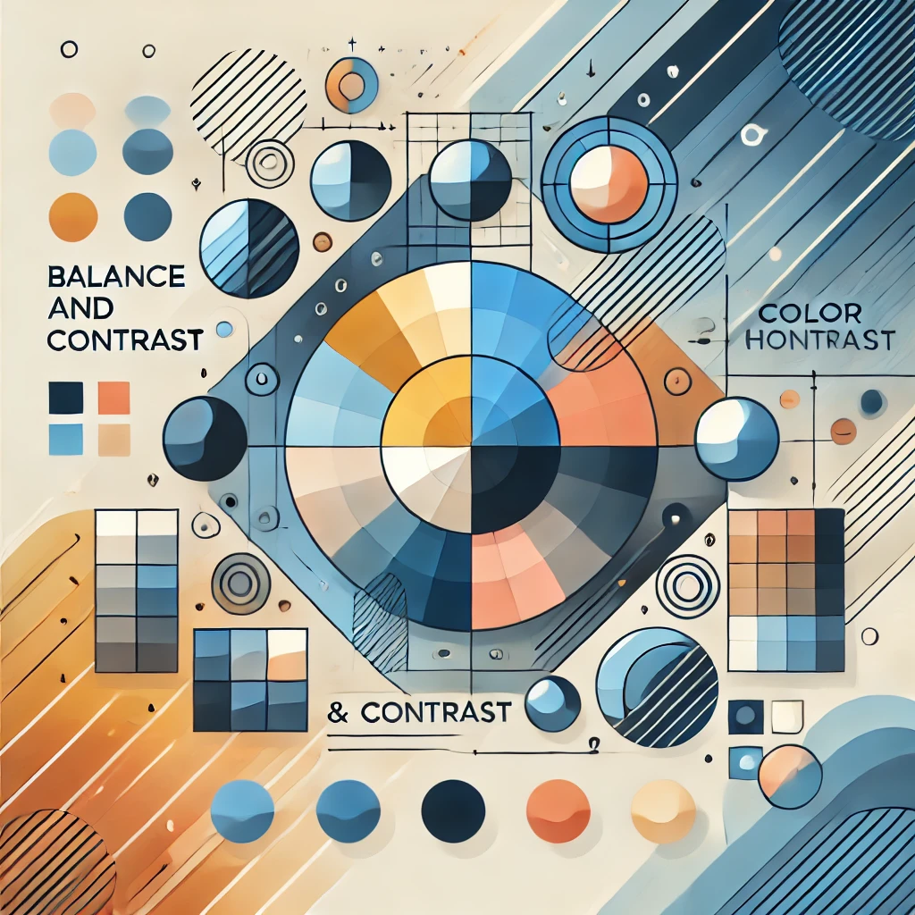
Color Harmony: Balance and Contrast
Balance
On pages 8-25 of Color Harmony, the concept of balance really stood out to me. The book discusses how different colors interact, emphasizing the importance of finding the right balance between contrast, saturation, and hue. Balance is crucial because it ensures designs aren’t overwhelming or overly simplistic. For my career, this principle is essential. When designing, I need to avoid overwhelming users with too much visual information while also keeping things engaging and easy to use. Getting the balance wrong can make a design feel chaotic or dull, undermining its effectiveness. Balance is key to creating designs that look good and function well.
Contrast
On pages 26-55 and 176-191 of Color Harmony, the focus shifts to contrast, which is all about how different colors can draw attention and guide a user’s focus. Contrast is vital for ensuring important elements stand out while maintaining a cohesive design. In my career, this is a game-changer. If everything in a design looks the same, nothing grabs attention, and users can become disoriented. Effective use of contrast helps highlight critical information without overwhelming the user or cluttering the interface. It’s about striking the right balance where the design is visually appealing and highly functional.

Final Thoughts
Balance and contrast are the foundation of good design, as they ensure both aesthetic appeal and usability. Color Harmony highlights how these principles work together to create visuals that are engaging and functional. For designers, mastering these elements is essential for crafting experiences that resonate with users and meet their needs effectively.
Designed and Developed by Kenny Morales • 2024